Gene set enrichment analysis (GSEA)
Last updated: August 21, 2025
Calculate enrichment scores for gene sets from the MSigDB
Differential expression analysis generates a large list of potentially interesting genes. This type of data can be too large to easily make sense of it in terms of biological pathways. Pathway analysis algorithms can be used to summarize the measured data from individual genes up to a broader pathway level. Gene Set Enrichment Analysis (GSEA) is one of the most popular forms of pathway analysis.
GSEA is available for both bulk and single cell RNA-seq experiment types on Pluto.
Glossary
Gene Set - a list of genes that are known to be associated with a biological pathway
Example: the “Hypoxia” gene set consists of 200 genes known to increase expression in response to low oxygen levels (hypoxia)
Collection - a collection/set of Gene Sets from the Molecular Signatures Database (MSigDB), a database of collections and gene sets
Example: the “Immunologic signature gene sets collection” contains 5,200 gene sets related to immune system response to different conditions
DEG table - the results / plot data produced by a differential expression analysis
Running gene set enrichment analysis in Pluto
In order to run GSEA, you first need to create a differential expression analysis. Once at least one differential expression analysis has been created, the Gene Set Enrichment analysis type will become enabled in the analysis sidebar in Pluto for that experiment.
Add a new analysis, select Gene Set Enrichment and select the differential expression comparison that you'd like to analyze with GSEA:
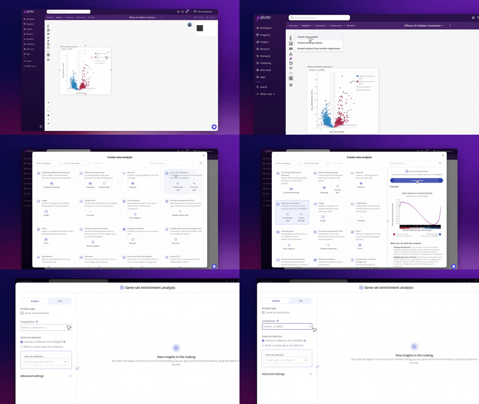
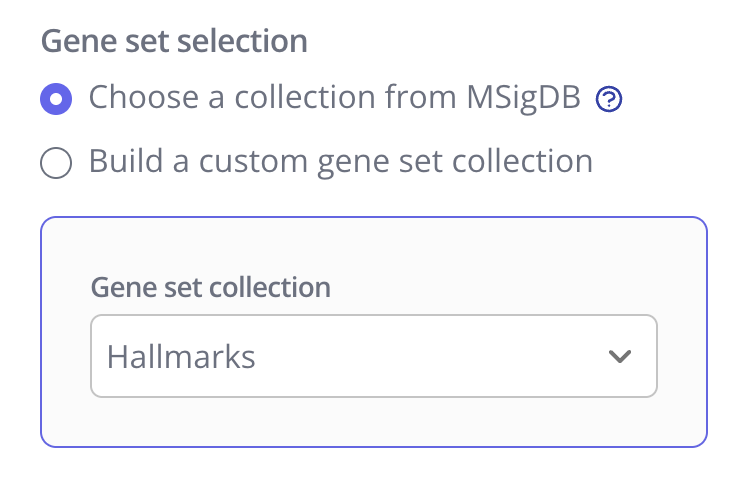
Next, select the gene set collection you'd like to use. You can either:
Select one predefined collection from the MSigDB
Build your own custom gene set collection using one or more of your own saved lists and/or one of the predefined MSigDB collections. Haven't saved any of your own lists yet? Read this guide on creating target lists.
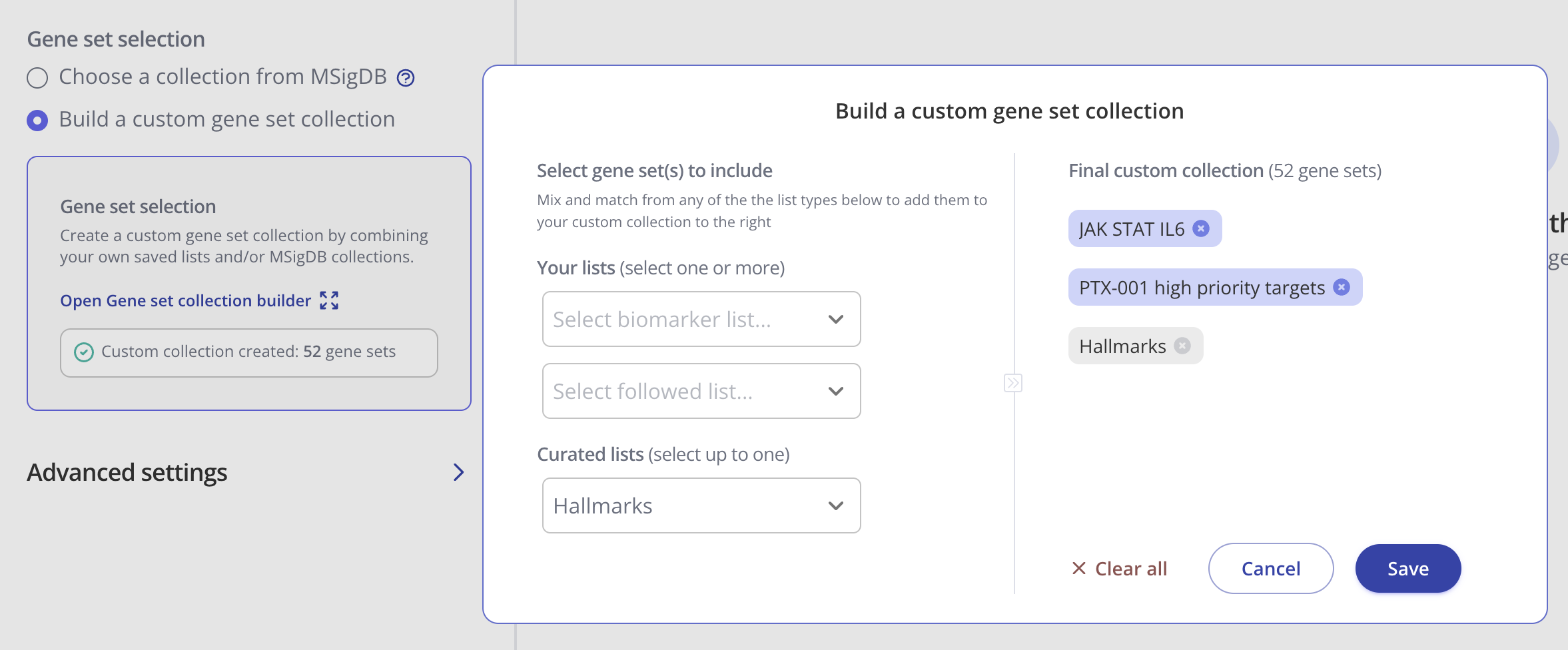
Once you have finalized your gene set collection selection, click Run Analysis to view your results.
Creating an enrichment plot for one gene set
By default, when your GSEA analysis completes, Pluto will display the most significantly enriched gene set according to p-value.
The enrichment plot contains:
Red-white-blue heatmap: All genes from the input DEG table ranked according to your selected ranking method (default: log2 fold change).
Black tick marks along the x axis: Genes that are annotated as part of your selected gene set (e.g. Cytokine-related genes in the example below)
Green line showing running enrichment score: A peak shape towards the upper left side indicates positive enrichment in that pathway because multiple genes in the pathway increased in the comparison. A dip shape on the lower right side indicates a negative enrichment because multiple genes in the pathway decreased in the comparison.
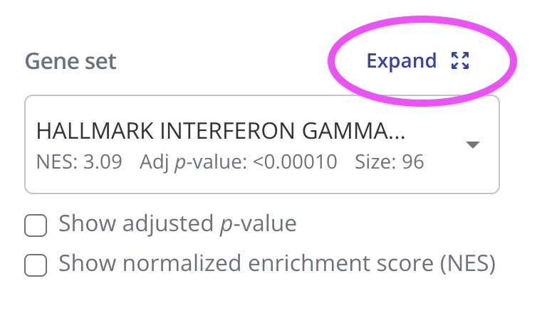
To view the enrichment plot for a different gene set, go to the "Plot" tab in the sidebar and select a new gene set from the dropdown. You can also choose to show the adjusted p-value or the normalized enrichment score for the new gene set. Click "Save Changes" to view the new gene set's interactive enrichment plot.
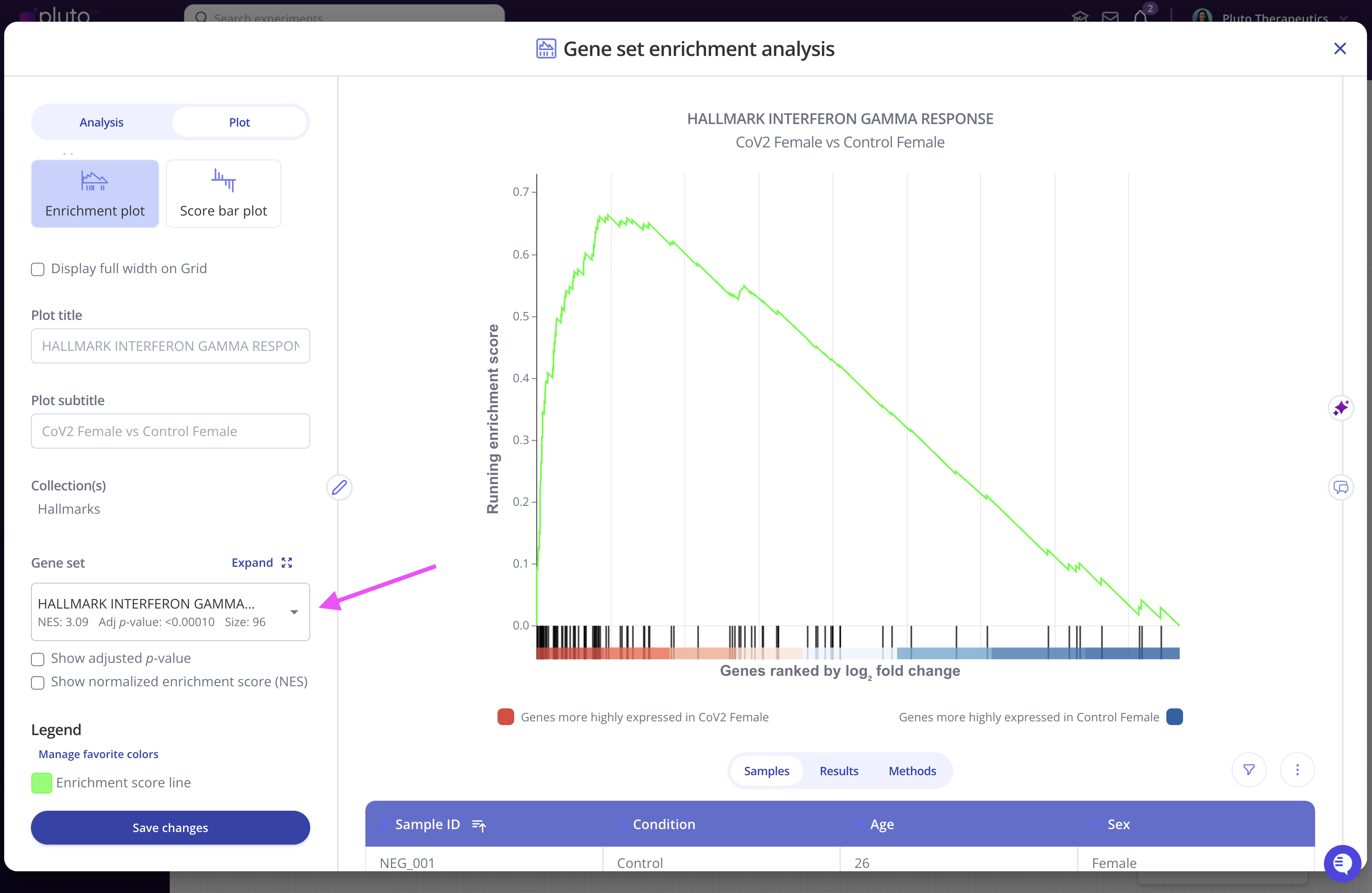
You can also edit the plot title and other aspects of the plot's appearance from the Plot menu.
Viewing all gene sets
GSEA outputs an adjusted p-value and a normalized enrichment score (NES) for each gene set in the collection that you selected when setting up your analysis. These values represent significance and magnitude/direction, respectively, and tell a researcher whether the gene set / pathway was significantly changed in their differential expression comparison of interest.
To view the entire table of gene sets, click the "Expand" button next to the gene sets dropdown. The gene sets table can be searched and downloaded as well.
Plotting multiple gene sets by NES
Another useful way to visualize GSEA results is with a bar plot showing multiple gene sets by their NES values.
In these plots, gene sets (x-axis) are ranked and displayed according to the NES values (y-axis). Positively enriched gene sets (NES value > 0) are shown in the dark navy color above, and negatively enriched gene sets (NES value < 0) are shown below the x=0 line in a light blue color.
To create this plot, choose the Score Bar Plot plot type from the "Edit Plot" menu. Optionally check the box to show the plot as full-width, and filter gene sets by their adjusted p-value and/or NES value. Click "View Changes" to view your plot.
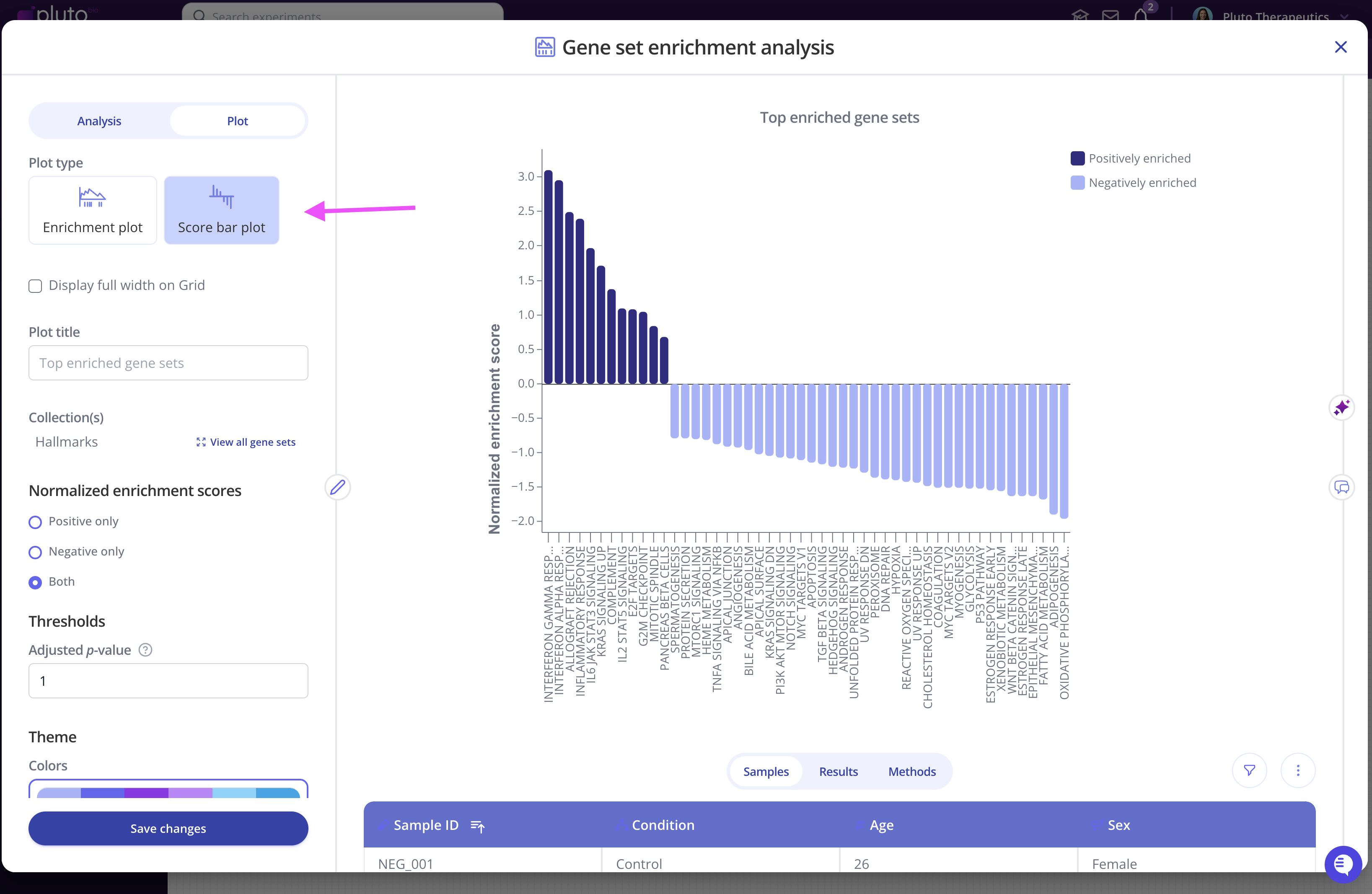
As with all Pluto plots, you can customize the appearance of the score barplot using the "Plot" menu in the sidebar.
Ready to try it out on your data?